Blender tutorial reflections
For my entire adult life (and most of my teenage life), I’ve had a casual interest in computer graphics, especially 3D graphics. Accordingly, I’ve been idly tinkering with Blender1 off and on since about 2005, though don’t let the long history fool you: I have yet to achieve any meaningful proficiency, let alone skill. For normal mortals, getting good at 3D art requires dedicated practice, and I’ve treated Blender as merely a toy to be played with now and again. (To be clear, in capable hands it is much more than just a toy–though let the record show I firmly believe toys are important, even for adults.)
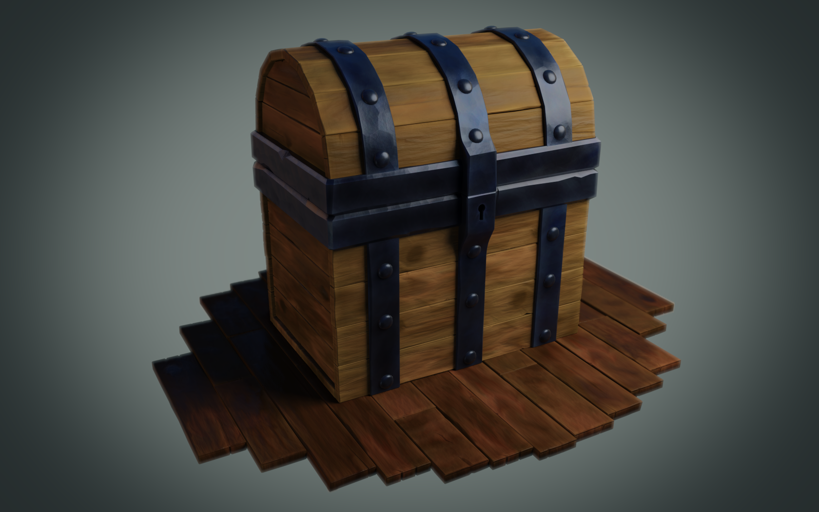
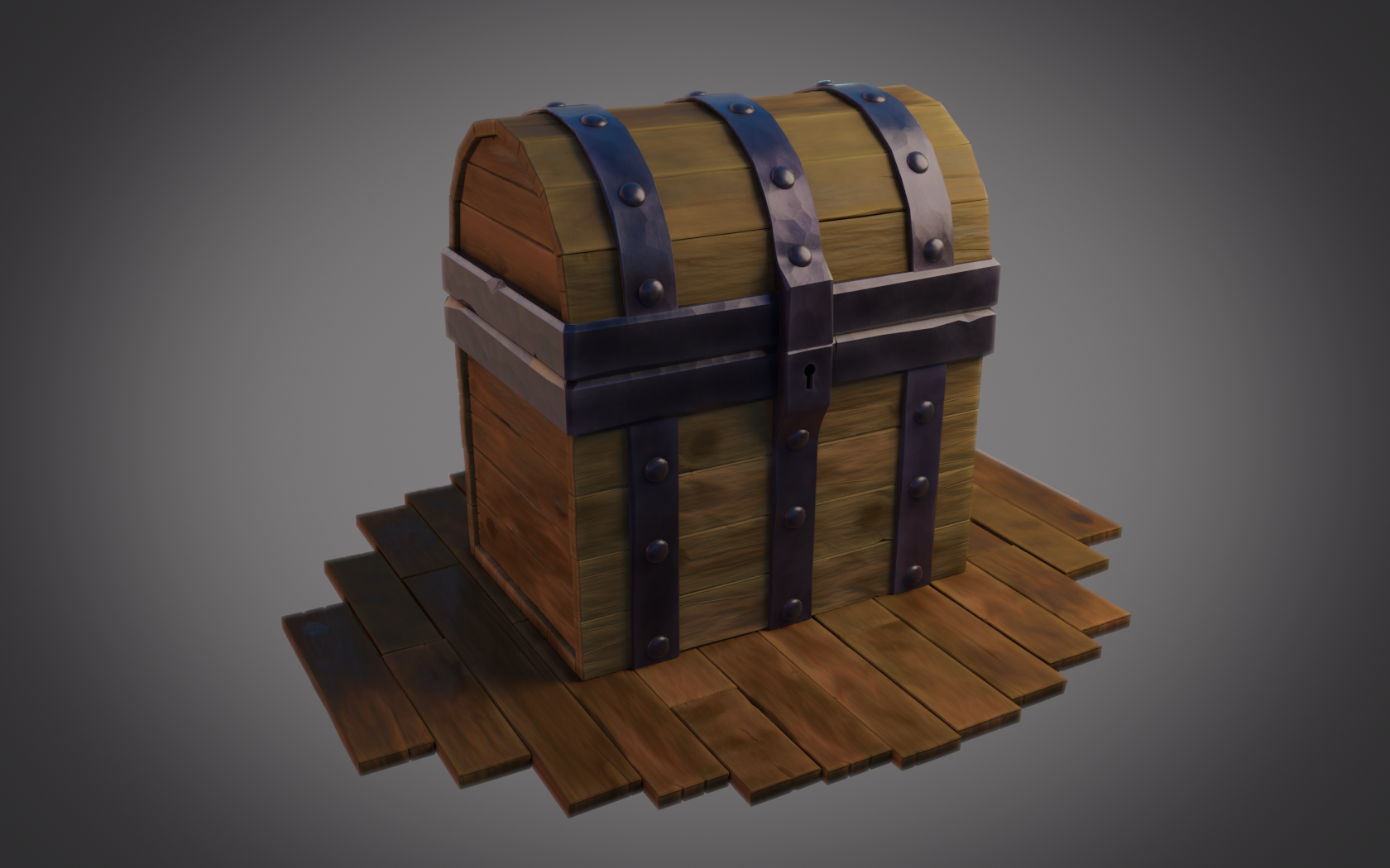
Quarantine seems like a good opportunity to spend some more time with Blender, so over the last weeks I’ve been working on a tutorial from CGCookie. The tutorial I followed is a fairly introductory guide to modeling and shading a stylized treasure chest. Here are my final-ish results with two lighting setups:


A few reflections on these images and learning from a tutorial:
- These results aren’t amazing, but I’m fairly pleased nonetheless. I learned something; I had fun; the tutorial was successful.
- The final result from the tutorial here
looks much more stylized and much more appealing than my renders. There’s a moment near the end of the tutorial where the instructor
adds a light and renders the scene, and all the sudden the charming stylized look pops out. When I hit render at the same point,
my chest looked…okay.
- I think this is mostly because the instructor made a more heavily stylized chest. Several times during the tutorial I thought tutorial material seemed over-stylized, e.g. really deep cracks in the wood boards. I was more restrained in my modeling, but this seems to have put me in an awkward middle ground where my result isn’t effectively cartoony but neither is it remotely close to photorealistic.
- That said, I still think some parts of the example render are overdone. For example, I think the depth of field is too shallow and the metal too shiny. But I can’t deny that overall the effect works in a way my image does not.
- When following this (long) tutorial, I found that differences between my work and the reference work compounded. One example: when painting the wood and metal textures, I opted for a lighter shade of wood than the instructor. As a result, at shading time my wood was lighter than my metal, whereas the tutorial had darker wood than metal. This required a somewhat different node setup for the chest materials.
- Frequently during the tutorial, I wondered why we were doing what we were doing. Obviously you can’t ask a recorded video for an explanation, but I think even a knowledgeable live teacher could only have gone so far. Blender is a tremendously complex piece of software, and deeply explaining what every option means would be totally infeasible.
- The tutorial website does have a way to ask questions (and friendly community members who answer them), and this was tremendously helpful for me.
- One thing I really like about 3D graphics, especially after this tutorial: there’s so much to learn. Whenever something seems even remotely interesting to you, there is a corresponding rabbit hole of theory and practice to explore. While doing this tutorial I became distracted and spent probably 5 hours learning about RGB color spaces, gamma correction, human color perception, etc. This is par for the course, which is awesome.
-
Blender is the leading open source 3D art program, and a shining example of how great open source can be. ↩